Not too long ago, during its seventh I/O conference, Google introduced its new visual language called Material Design . This beautiful, intuitive and content focused design style is indeed a new set of guidelines for both designers and developers, helping them deliver users a unified, consistent and playful experience.
Previously titled Cross-platform design, Material Design style has got tremendous popularity among designers in a very short period of time. It’s now being incorporated not only in Android apps but also in web interfaces. Loaded with vibrant colors, tangible surfaces and fluid motions, Material Design language treats software as a substance.
In this blog post, I'll make you familiar with nine core principles which Material Design is based upon. After that, I’ll showcase you five most popular android apps that adopted this vibrant and inspiring design style. Later, I’ll be presenting a list of web UI frameworks through which you can implement Material Design in your web design projects.
Let's begin!
Key Principles of Material Design Style
Material Is The Metaphor:
The primary focus of Material design is on bringing design elements, transitions and animations together and making them appear as real as they are in real life. This design style is a result of Google team’s profound research on paper and ink and therefore, it is based on tactile reality. In a nutshell, Material design is invented to provide context to users in a digital space.
Surfaces Are Tangible And Intuitive:
Material design keeps what’s much important in front of users’ eyes, utilizing the principles of print design. Taking advantage of the physical structure established by edges and surfaces of the material, users can easily get visual cues to what they should interact with. Thus without using much of their brains, users are able to understand affordances as fast as possible.
Dimensions Afford Interaction:
In material design, each element has its own hierarchy and shadows to be able to grab user’s attention. Just like a stack of files on the desk, where each file gains dimension and protects its own shadows, elements in material design are crafted using the basic principles of light, surface and movement. Realistic lighting gives users the most realistic view of the user interface.
One Adaptive Design:
Material design visual language has been specially created to adapt screen of any size. Using a single underlying design system, it delivers users a unified experience across multiple devices and platforms. Implementing the concept of one adaptive design, it creates a specialized view for the particular device via which a user is accessing the interface.
Bold, Graphic & Intentional Content:
Introducing a fantastic and vibrant color scheme, Material design style helps you create a bold and graphic interface that user had never experienced before. Large-scale typography, intentional white space and edge-to-edge imagery create optimism, clarity and immersion. On the other hand, refined Roboto font provides users a better reading experience.
Emphasis On User Actions:
This UI design concept puts a huge emphasis on how interactions between users and surfaces can be made more digital and responsive than before. In material design, an action performed by a user is an inflection point that surprisingly transforms the entire design. This kind of responsive interaction encourages the user to dig into interface more and more.
User Initiates Change:
In material design, any change in the user interface derives its energy from the action performed by a user. It's exactly the same way you touch the surface of water and wavelets gets generated by the energy received from your touch. Treating the user as the prime mover, this design language delivers a real-life and tangible experience to users.
Animation Choreography:
This principle states that all actions in material design occur in a single environment. When a user performs an action, objects appear with an incessant animation which is choreographed on a shared stage. However, they transform and reorganize to make your screen look captivating and engaging, but a proper rhythm is maintained between them.
Authentic Motion:
Since the beginning, Google has focused delivering users the best experience possible. Material design style is also created with the same philosophy in mind. According to this 9th principle, Motion in material design should provide continuity to the user. Not only should it be beautiful but also be meaningful and relevant.
Apps That Show Off Material Design
After the release of Android L , many of the android apps have got revamped with the concept of Material Design. Below are five awesome examples of apps that are making the most of this brand new design style.
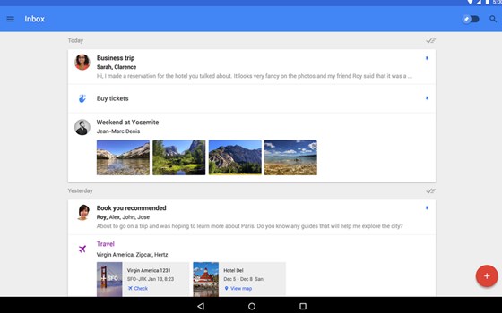
Inbox, Google’s new email app, is probably the first application that incorporates Material Design philosophy since the beginning. It offers a flatter, smooth and swipe-centric user interface with cohesive colors and lets users focus only on the most important stuff. On top of that, the web version of Inbox also embraces Material Design wholly.
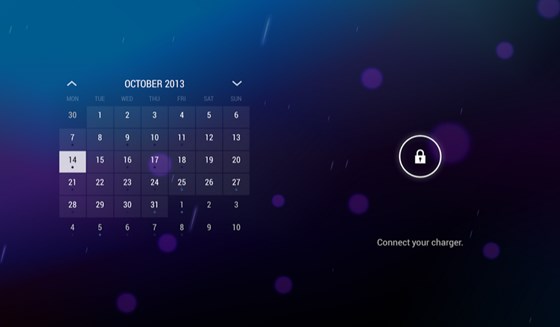
Today Calendar, a calendar replacement app for android, also got a taste of Material Design. With the use of bright and vibrant colors, it now has become absolutely gorgeous. Excellent split-screen user interface, delightful animations and subtle use of the floating action button make this app exemplify the spirit of Material Design.
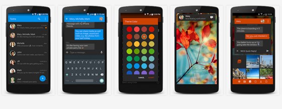
Textra SMS is the first messaging app that features Material Design. Smooth as butter, this elegant application is full of delightful animations and can be customized with a wide array of material design colors. Best of all, it supports Pushbullet app which also got updated with snazzy Material design.
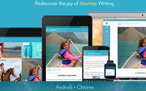
Journal by Journey is another app built with Material Design in mind. It features a transparent status bar, has a bold blue color and uses minimalistic fonts and iconography. There are no superfluous design additions to distract the user. It is one of the apps that immediately adopted Material Design after its launch.
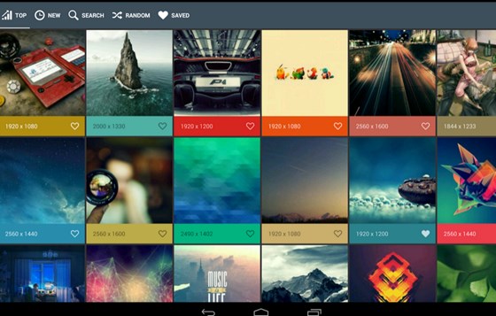
Wally, a wallpaper app, is a great example of Material Design in use. This gorgeous app utilizes subtle touch animations, floating buttons, bright color scheme, fading transitions and colorful page swipes. The user interface of Wally is quite easy to use and therefore provides users a fast and smooth experience.
Frameworks to Bring Material Design to Web UI
Soon after Google applied Material Design to desktop web interfaces of Docs , Drive , Sheets and Slides , several frameworks came into existence to make it easy for designers to adopt Material Design in their web projects. Below are some of them:
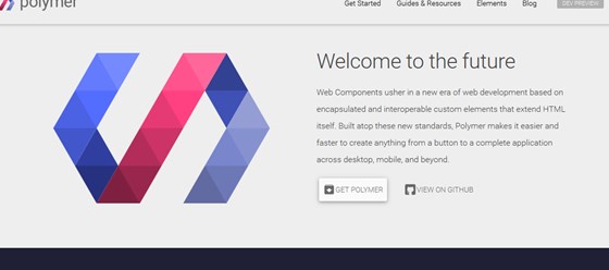
Google’s Polymer is one of the most popular frameworks that are being used to implement material design for the web. Built with latest web components standards in mind, Polymer makes it possible for you to create anything from a custom element to a complete web application in minutes. To help you get started quickly, Polymer provides you a getting started guide with comprehensive documentation.
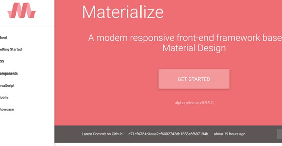
Materialize is a modern responsive front-end framework built and maintained by a small team of five students of Carnegie Mellon University. It comes in two forms: Materialize and Sass. Materialize is the standard version, whereas Sass includes the source SCSS files. Including basic components such as forms, cards, buttons, grids and footer etc, Materialize simplifies the developer's life.
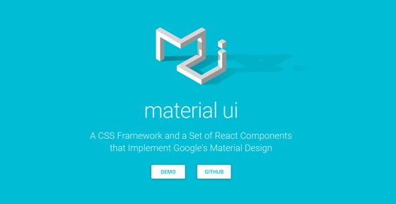
Material UI, written in Less , is a CSS framework and a set of various React components, which you can use to implement Material Design in your web projects. It supports components such as date picker, dialogue, menus, sliders and switches etc. Available as an npm package , Material UI can also be found on GitHub .
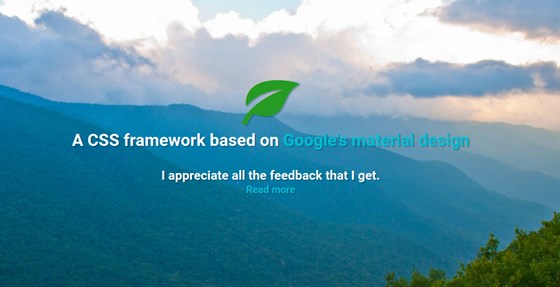
Leaf, developed by Kim Korte , is another CSS framework that lets you implement Material Design to develop web UI. While still in beta version, it has an extensive list of components that are quite mature. Instead of using original Material design icons, Leaf includes Icomoon Icons. Leaf is available on GitHub as well.
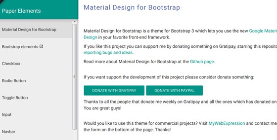
If you are in love with Bootstrap and don’t want to mess with any other front-end framework, then Bootstrap Material is made for you. Bootstrap Material is a theme for Bootstrap which enables you to use Material Design style in your favorite framework. It supports a wide range of Material Design Icons and is also available on GitHub .
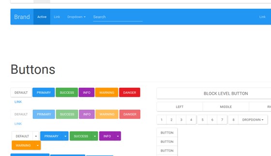
Bootswatch Paper is another theme for the Bootstrap framework. It includes all the components, which are included in Bootstrap, in a Material design skin. Also, it has support for various material design components such as buttons, indicators, forms, tables, pagination and progress bars etc.
What you think about the success of Material Design concept in web design?
Is the future of Material design bright?
Do you have any other Material Design Web UI framework in your mind?
I would love to hear from you. Let me know what you think via commenting.