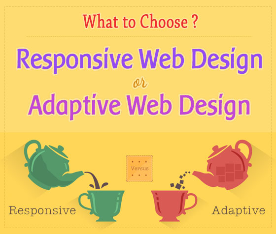
Nowadays, people use a lot of various devices to surf the Internet. More and more of them prefer smartphones and tablets, so a website must provide the best user experience on any device, be it a mobile phone, a tablet, or a PC.
To achieve that, designers employ one of two approaches to designing a website : responsive and adaptive web design.
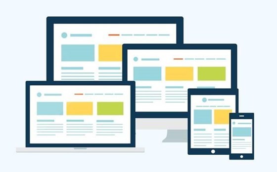
Source: dribbble.com
In this article, we'll explore these two approaches, outline the differences in their methods, and make tips on how to choose which approach is best to follow.
1. What is Responsive Web Design (RWD)?
The first time the term "responsive web design" was used by Ethan Marcotte in his article " Responsive Web Design " in 2010. Later, he published his book "Responsive Web Design" that became a guide to RWD for many designers.
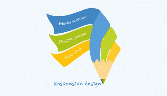
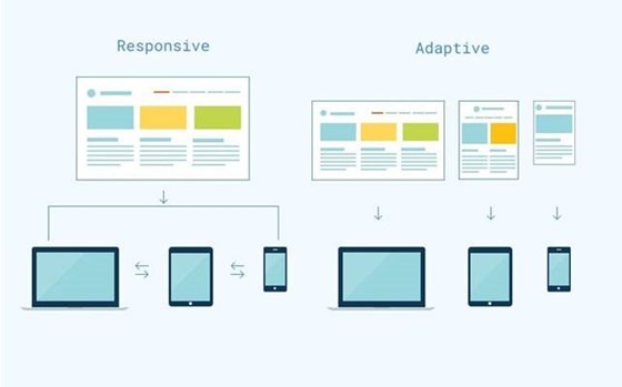
Responsive web design adapts to the width of the screen and is device independent.
According to Marcotte, responsive web design makes the content on your website respond to a width of any device and browser screen.
A website with RWD requires three essential components:
a) One Fluid Base
A fluid base means one layout that adapts to various devices by changing the content on the website relatively to the screen size.
To make it work you need to use em and percents for fonts instead of pixels. That will make a web page change appropriately to the size of the browser or device screen.
For instance, if one element takes 40% of the page it will remain so, no matter what size of screen it is.
b) Media Queries
Media queries identify which set of styles needed to apply to a web page.
Traditionally, designers create responsive web design with three main sets of style: mobile, tablet and PC. However, it isn't a rule, so you can create more if you'd like to.
See Also: CSS Media Queries, How to Use CSS To Create Responsive Images
c) Flexible Visuals
In responsive design, all media components also change relatively to a block where they are situated.
Also, it is important to appoint maximum width for pictures and videos, so they never get wider than the block. It will make a website design much more mobile-friendly.
2. What is Adaptive Web Design (AWD)?
Adaptive web design, or AWD, is a new definition of progressive enhancement. It identifies the device screen size and provides the appropriate layout for it.
AWD helps create the best UX design, so a user can access a website without any technical limitations.
Adaptive web design is based on different set of layouts for different devices and screen resolutions.
You may think that this approach is hardly different from the responsive web design because they both make a website adapt to the screen width and use similar technologies. However, they have significant differences in the way they work.
While RWD uses one fluid layout, AWD is based on a set of layouts for different screen resolutions. This makes a website UX better not only for smartphones or tablets but also for TVs and on-board computers with enormous screens that have the highest resolution.
Of course, it is unnecessary to create layouts for all existing resolutions. You just need to find out who your target audience is and what types of devices they might use.
AWD Strategies and Principles
Adaptive web design is created on a base of two development strategies: graceful degradation and progressive enhancement.
Graceful degradation is a traditional web development strategy that requires creating a website design with a good level of UX in modern browsers.
Although, it will remain presentable for older browsers, maybe not so pleasant, but still with the basic functionality.
Another strategy used within AWD is progressive enhancement.
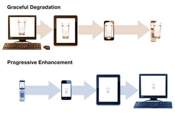
The strategy has the same objective as graceful degradation but only vice versa. It means that a website is created with an established base-level of UX for old browsers.
Advanced functionality will be added once a browser supports it.
The progressive enhancement strategy is the best choice for those who strictly follow the AWD principles.
It's rather convenient because every stage brings you a website suitable for a new browser, and within each other step your product gets smarter with the help of HTML markup that shows static content and, of course, CSS and JavaScript that give dynamic look. This strategy allows you to get a simple, but complete product quickly.
However, in case you want to create a mobile website, the Mobile first principles will come in handy.
Luke Wroblewski, a digital product leader, was the first to use the term. He says that the idea of Mobile first principles is very close to the progressive enhancement but it relates only to a mobile web development.
It means that in a first place a website is designed for a smartphone, so it has concise design and all the content is densely placed in one or two columns. Only after the mobile version, the website is developed and designed for other devices.
A website developed on mobile first principles can look good on a laptop too.
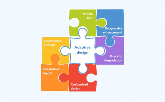
Summarizing, we can say that a website created on the base of the adaptive web design principles needs to include:
- A content that varies on a different devices.
- Some sets of layouts.
- An approximate design for each type of devices.
You can identify adaptive design comparing two website versions: mobile and PC.
If they provide different functionalities e.g. a button "Call us right now" on PC version changed to "write us an email" on a mobile version, it certainly is an adaptive design.
3. Comparing the Design Approaches
a) Responsive Web Design
Following are the pros and cons of Responsive Web Design (RWD):
Advantages:
- One URL for all versions eliminates confusion and makes your site easier to market.
- Website responsiveness improves SEO rates.
- Your content will be displayed correctly on various devices.
- Adequate user experience on various devices.
- Maintenance of a responsive website is a much easier and cheaper.
Drawbacks:
- There can be too much content on a mobile screen.
- You can't create a custom product for all the diversity of modern devices.
b) Adaptive Web Design
Following are the pros and cons of Adaptive Web Design (AWD):
Advantages:
- Better device-targeting process.
- You can create a visually appealing and customizable website for the particular type of devices you target the most.
Drawbacks:
- More expensive and complex development process.
- More complicated updating and maintenance.
4. Final Points
Responsive Websites are Good for You if You Have
- Limited time and resources.
- A simple and clean design and functionality.
- A desire to simplify the processes of maintenance and updating of your website.
Adaptive Websites Will Be the Best Choice If You
- Positive about that your audience uses a wide variety of devices.
- Possess both time and resources to create and maintain several versions of your website.
Finally, we want to say that these two approaches is rather different. And to find out which one is better is almost impossible because both have positive and negative points.
So, it is for you to decide which one is better and more suitable for you and your product.
In this article we've told you about both approaches and we hope it will help you make your choice.
Read More: What is Responsive Design and Why Do You Need It?