Web design is a dynamic field and is subject to the impact of technological changes and innovation that sprouts daily across the globe.
To track trends in this regard is quite hectic but the core values revolve on the anchor of accessibility and usability and to a large extent on user preferences.
User experience plays a huge role in what constitutes a trend as more users prefer to stick to innovations that make their experience more rewarding and less strenuous.
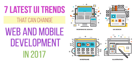
Here is my outline of the 7 latest UI trends that can change web and mobile development in 2017:
1. Scrolling
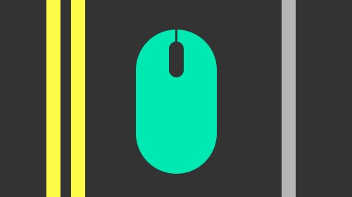
Scrolling has been used over and over again in recent years and is one mechanism that web users are familiar with. The edge it presents is showing up on many devices across desktop and big-screen platforms.
The ease it provides users in searching for rich content across websites and blogs is such that is laudable and is sure to endure in the New Year.
2. Decline Of Stock Photography
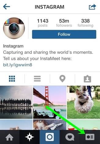
New apps and mechanisms for user-generated content have been spurred by social media platforms like Instagram and Snapchat.
Images that are self-generated provide a lure and a peculiar appeal that cannot be likened to the predictability of stock photography.
While the quality and texture of user-generated images might vary from the acceptable to excellent, it trumps stock images because of the peculiarity it presents.
This surely is leading to dampened relevance but not the extinction of stock photography.
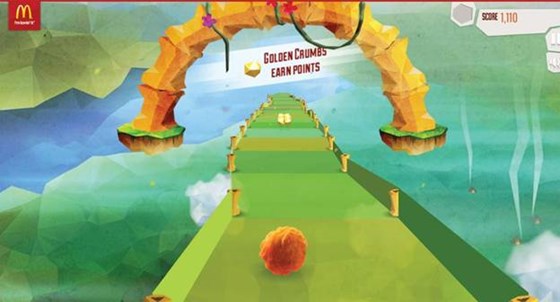
3. Full-Screen Videos
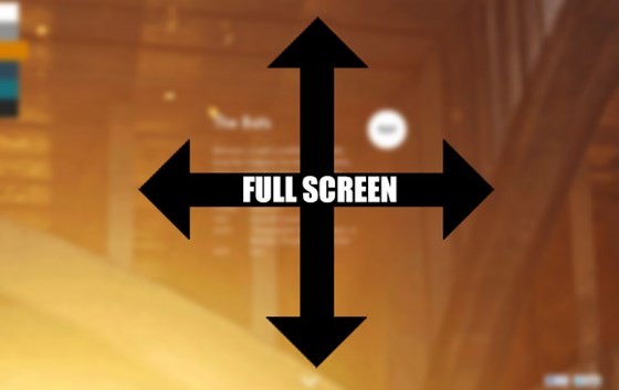
The place of sensory perception is such that cannot be overlooked and it is actively explored by developers of video ads and pop-ups across websites today. Video spurs curiosity and gains the approval of users when made in excellent quality.
The engagement quotient that videos provide is a marketing nugget that only gets accentuated when a beautiful typefaces complements it.
That such videos are easy to expand to full-screen without diluting their quality or effect is a huge plus that underscores the recognizable user attraction.
4. Illustrations
Illustrations present an edge that is missing on images as they encapsulate a larger scope of customization while images only define portrayed realities. They are able to conjure a visual slant that suits the app you decide to use.
The ease of incorporating themes and colors that might suit your brand is such that makes it possible to introduce any character you desire to highlight.
This gives your brand a distinctive slant that cannot be pinned to competitors.
The innovativeness of illustrative apps makes it possible to utilize parallax scrolling as well as other visual connotations in your web design . This can spur immersive stories which are the meat of viral content that dominate the web with its subtlety of storytelling.
5. Parallax
Parallax makes it possible to flip through any background at a pace that is slower than any sizeable foreground on a webpage.
Parallax is definitive as it is a tool to add storytelling seamlessly in order to enhance user interface on a website and this explains the brand attraction to this innovation.
While parallax might be a fad, it is desirably an interesting slant utilized in web designs in order to enable user experiences that are fast-paced.
As long as you skip an overload of visuals and ensure fast-loading, parallax designs are worthy enablers for storytelling that makes for user engagement.
6. Vivid Colors
Colors tell a story those appeals to the aesthetic intelligence of users as they spur the dynamism and warmth that attracts user interest.
The safeguard is that whilst you explore color palettes; look out for harmonized content tone so that you do not have a mere color splash that lacks depth.
Since colors are vivid expressions, the care that is expected, is to prevent any tone that depreciates user experience. Look out for how to match colors and content for optimal UX.
7. Grid Flexibility
Working with the grid makes it possible for there to be a foundation that will enable rhythm, balance, consistency and order in your web designs.
Since it enables user experience with such enriching features for natural and intuitive navigation, it has been a preferred standard.
The long-form presently is that since the grid has restrictive structures in its baseline, designers have begun to experiment with going beyond the grid in order to enrich user interface.
This approach is getting a foothold with the introduction of focal points that revolve around depth, layering and motion in the creation of peculiar pieces.
This burst of creative juices is making it possible to explore new forms and thresholds that were previously considered unreached.
You should expect more designs that thrive on an approach that goes past the grid in the New Year as web designers explore new heights to enrich user experience.