There are plenty of online storefronts available nowadays and, irrespective of the fact that almost all of these storefronts have similar inventories, sales statistics of each of these stores vary significantly.
Conversion rate plays the deciding role in this, and it depends substantially on the design of your storefront. A simple, easy to use, customer friendly design is the common aspect that every top online store maintains.
There are lots of design considerations if implemented carefully, make the customer choose your store every time and hence your conversion rates will escalate.

Common faults in design such as the use of too much artistry or flash animations slow down the loading of your page and thus should be avoided.
See Also: 5 Effective Ideas to Increase Revenue From Your Online Store
Appealing and intuitive designs clearly paves the way for better sales and below are five tips that work efficiently in achieving this:
1. Make Sure Your Shopping Cart Should Be Easily Visible
When you roam around a retail shop, a shopping bag or cart is your constant companion wherein you keep your chosen items. Same thing applies to online shopping.
It is practically feasible for the customers to have access to the shopping cart with their online shopping. A detailed shopping cart space displaying the items chosen, total amount payable makes it easier for the customer to carry forward their shopping plan.
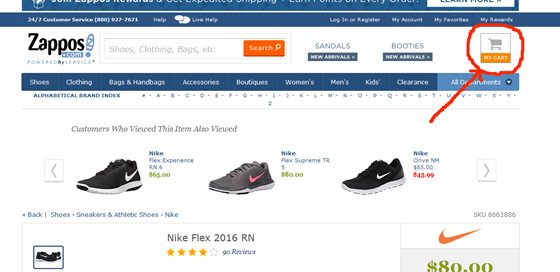 An example of displaying Shopping Cart button on top right corner for easy accessibility
Normally, customers want to browse around different categories, pick up items, and edit their choices according to their budget. So, a corner of your online store-front committed to an elaborate shopping cart will keep the customer glued and complete their shopping satisfactorily.
See Also: 12 eCommerce Shopping Cart Apps for Facebook Storefront
2. Make Your Add-to-Cart Button Clear
It is better if your "Add-to-Cart" button is direct and clearly labeled. By direct and clear it means labels such as "more info/details" or "learn additional" should be avoided.
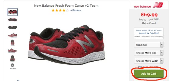 Add to Cart button should be clearly visible
Some customers might avoid clicking on such buttons and instead search for add-to-cart button and ultimately shy away from your site.
So, use direct call to action caption such as "buy now" or simply "add to cart" to be specific and ease out customer experience.
3. Organize Your Product Pages
The motive is to increase the sales conversion rate and that comes with their clients completing their purchases. Customer satisfaction is the deciding factor here which depends on the design of your product pages.
Organizing your product pages is complex and has many aspects. First is allotting products carefully to proper categories. Next is the detail of each product.
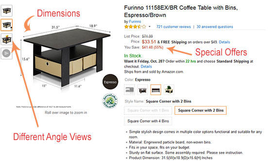 An example of product display with dimensions, different views and special offers
Your product page should clearly display multiple images of the product for the customer to verify his choice satisfactorily. The details of the product mentioning brand the name, size, shape, material etc should be there.
Customer review is a critical aspect to take care of. Customers mainly seek the reviews regarding the product before finalizing their buy.
The most common and easy arrangement is: product name at the top with images below, then give the details of the product, and lastly put the customer reviews and links to similar choices.
See Also: 5 Common Product Description Errors Hurting eCommerce SEO
4. Simplify All the Navigation Paths
Obviously there are plenty of categories and sub-categories for your online store and putting them on one page is not a good design.
It is also a frustrating experience for the customers to navigate a page containing so many features. A pleasant navigation is very important for customer satisfaction.
There are simple steps to achieve this. Take care of all hidden menus on your page. Hidden menus irritate an online shopper the most and so try to remove every such hidden element from your page.
Instead introduce 'fly out' menu (the tab which appears only when the pointer comes to it and fly out instantly when you mouse away from it) showing all the informational detail that a shopper requires.
This way you can keep your page simple yet informative. A buyer can easily shift between categories by these fly out menus.
Another important aspect to take care of is the bridging element. Keep a way back for the customer by using bridge paths between the categories and sub-categories so that he can trace his way back smoothly.
As for example, a simple element like "continue shopping" at the bottom of the cart page aids the shopper to instantly jump back to the shopping page.
5. Let the Checkout Process Be Simple
An easy checkout process is a permanent impression in the shopper's mind. Don't make your check out page sophisticated with sidebar navigation etc.
A customer needs a hassle free check out to complete the shopping. Ignore ‘continue shopping' or 'suggested items' tabs here. The finance related details like credit card/debit card info etc. along with the delivery address should be clearly displayed with contrasting colors and as direct as possible.
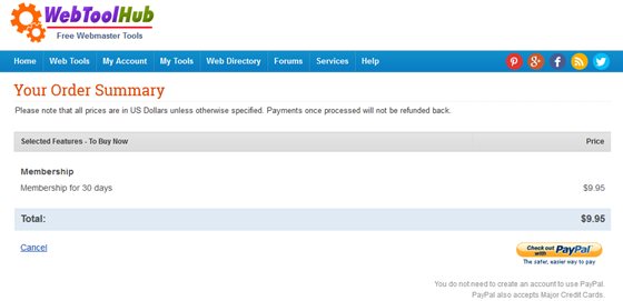 The order page should be clean and distraction free - An example
It's a good idea to put all these elements in one page; that way you are minimizing chances of swaying away from the customer at the last moment.
Remember, a simple, and smooth checkout process is immensely elemental in increasing sales of your online store.
See Also: 5 Effective Ideas to Increase Revenue From Your Online Store