UX or user experience is all about feelings of the users when they visit your website. User experience and conversion rate and are intimately linked.
If your website have bad design, poor content, many different colors that don't go together, poor site navigation etc. the visitor's will leave your site as quickly as their browser allow.
You definitely don't want to lose your website visitors without taking your desired action, right?
See Also: 6 UI/UX Designing Tips that can Improve Your Conversion Rates
Then, you need to provide the best experience to the users through features, products and services. Having a good UX in a website will help to keep the visitor's in a website and definitely that will result in higher conversions.
In this article, I'll be revealing 9 actionable UX tips to improve your web UX for maximum conversion.
Let's get started.
#1: Use Plenty Of White Space
White space is the portion of a page left empty. Having plenty of white space in your website guides your visitor's attention to the most important elements.
More white space equals less noise, making it easier to focus.
If you don't use enough white space then your potential audience may not understand what you want them to do. The more components competing to draw attention, the less attention a user pays to the website.
For example, if it's hard to find your call to action button or form, your visitor's will not be amused and they will probably move to your competitor's site.
When a website strikes the right balance of white space, it's easier to process with it and provides a better overall user experience.
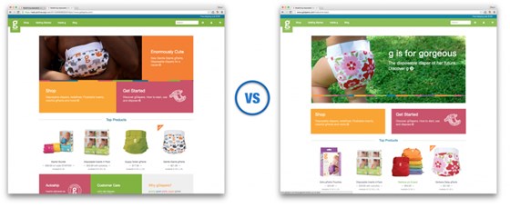
GDiapers Lifted Their Conversion rate by nearly 20% just by adding some space between the main banner image and the two callouts below.
#2: Improve Loading Speed
There's nothing more frustrating than when the user's need to wait too long to load your website. Most of the people expect to load a website within three to four seconds.
If your website loading time is more than three to four seconds then it's clear that your audience are getting bad user experience.
When you have any bad experience somewhere, you never go back to that place again and you tell others no to go there.
Therefore, make sure your website loading time is less than three seconds so that your audience can have a good user experience when they visit your website. Having better user experience means better conversions.
Don't trust my words?
Let me give you a proof here.
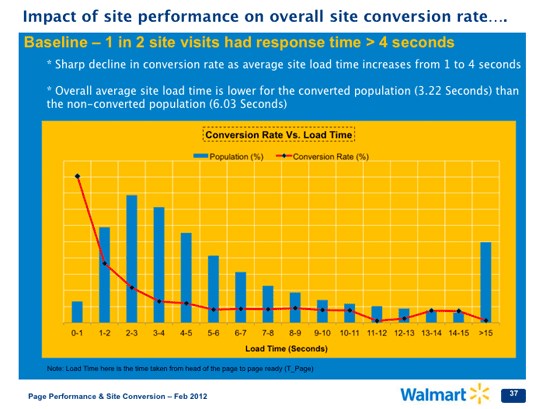
Walmart Found up to 2% increase in conversion for every 1 second of improvement and for every 100ms of improvement in loading speed, they grew incremental revenue by up to 1%.
#3: Use Attractive Call To Action Button
I have come across many websites without a prominent call to action button and they just left the visitors without any clue what action the visitors should take into their websites.
Your call to action button must stand out from the rest of the page and it should be clearly visible into the website. Because, don't expect your visitor's will spend their valuable time to find out your call to action button.
Here are few things you must consider:
- The CTA button color must be contrasting with the background color
- Button text should clearly explain what will happen after clicking on it
- You should place the CTA button above the fold
You may also follow these effective tips to create a CTA button.
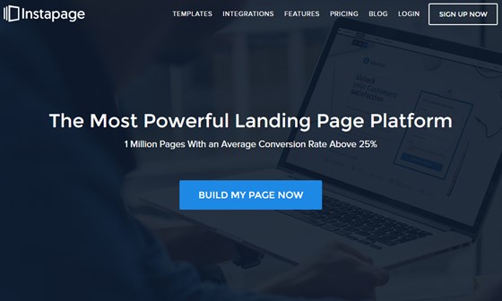
I will show you a neat example what I have explained so far. Instapage, a landing page building platform, did an excellent job here. The button color is contrasting, button text is clearly explaining what will happen after clicking and the position of the button is in above the fold.
#4: Add Images But Wisely
I believe we all heard that, a picture is worth a thousand words.
I strongly agree with the statement if you can use it wisely.
What I mean by that?
People are smart enough to judge your website. When they first visit your website they can easily identify the stock photos that they have already seen elsewhere.
Using the stock photos can decrease the trust on your website. If people don't trust you then there is very less possibility to proceed further with you.
Make sure every images you use are unique and meaningful. Using meaningful images not only make your website visually appealing but also help to keep less text on a page.
Moreover, your audience love images. Marketer Jeff Bullas cites that content with relevant images gets 94% more views.
Highrise boosted their conversion rate by 102.5% just by adding an image of a happy customer on their homepage.
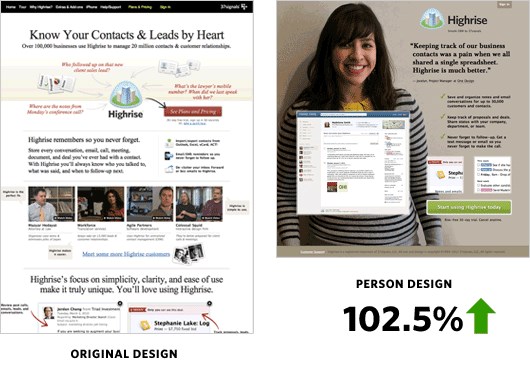
Source: kissmetrics.com
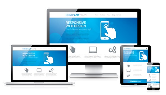
#5: Be Responsive
Responsive design ensures that a website appears perfect from all devices, whether on a desktop, smartphone or tablet. It allows the websites to change the layouts according to the visitor's screen resolution.
Nowadays, huge amount of people are using smartphones or tablets to browse websites. If your website is not responsive then your site will appear broken from smartphones or tablets. As a result, you may lose some potential customers with bad user experience.
So, having an unresponsive design can decrease your website conversions.
See Also: What is Responsive Design and Why Do You Need It?
Therefore, make sure your website is responsive so that your audience can access to your website irrespective of the devices they use.
Source: websitica
#6: Ensure Better Readability
Readability is not just about your audience can read something on your website - it's also about whether they want to read it.
The structure of your content will determine how your audience will read your content and respond to your message. If you put a big chunk of unformatted text, then people may not bother to read your content.
If your audience don't read your content then how would you expect to take your desired action in your website?
Therefore, you need to ensure that your content is easily readable.
Here are some guidelines for better readability on the web-
- Use high contrast between background and text
- Keep paragraphs short
- Use bullet points
- Use short sentences
- Choose easily readable web font
- Don't underline words if they're not links
- Don't use jargon
Let me show you a perfect example from Copybloger blog. Is their content easy to read?
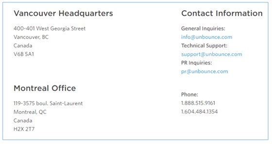
#7: Include Complete Contact Information
You must include the complete contact information on your website so that people can contact with you whenever they have any question.
Providing complete contact information not only ensure the good user experience, it also helps to build trust on your website.
When potential customers see your complete contact information, they will immediately perceive that you're legitimate.
The following information you should include in contact page:
- Company name
- Phone number
- Email address
- Contact address
Unbounce provided multiple contact information into their contact page.
I recommend that you add your phone number and email address on the footer area of every page on your site.
#8: Add Search Field
Having a search field make it easy for the users to find the things in a website. Unless you have a very small website with little content, you must include a search bar.
For example, if you run an ecommerce website with five thousands products and if you don't add the search bar then how people will find the products from your website?
When people can't find the desired products easily, they will be frustrated and will leave your site with bad experience.
So, keeping the search bar is essential for giving good user experience as well as for better conversions.
Make sure the search box is easy to find on your site and place your search box at the top right corner as users typically look there to find the search box.
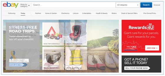
Ebay has a search box with category option to find the products easily.
#9: Consider the Trust Factors
Lack of trust elements in a website can hamper the conversion rates. There are so many things people consider before purchasing something online like:
- Is your company reliable?
- Is your product quality up to the mark?
- Can you product meet their requirements?
- Is their personal information secure with you?
Now the question is how you can answer the above questions on your website?
Here are some ways you can that easily:
- Include the customer testimonials
- Showcase the endorsement from a popular person
- Use security badges
- Show real images of your product in use
Once these trust factors are settled in the minds of your audience, you won't have much trouble convincing them to purchase from you.
Final Thoughts
You won't be able to survive in online business, if you can't offer good user experience in your website.
By following the above nine UX tips you can make your website more user friendly.
What UX tips have you found to be most effective on your website? Let me know in the comments below ??
See Also: 6 UI/UX Designing Tips that can Improve Your Conversion Rates