Minimalist web design describes the most basic design, stripped of unnecessary colors, elements, shapes and even textures.
Although designers may try to use a bolder design that is rich with features used to engage the visitors, research has shown that most users are attracted to websites with a clean design.

Mastering the techniques used to make a minimalist design may appear to be easy at first, but designing with a lot of open space and very few objects can be quite difficult, as most clients prefer to stuff the pages with as much information they possibly can.
See Also: Quick Tips for Web Design That You Need to Follow in 2017
A good minimalist design is often described by the professionals as something you will know the moment you see it.
There isn't a specific formula one can use to add a minimalistic look and feel to a website.
However, there are some main characteristics of this design, including:
- Simple user interaction and functionality
- Simplified and shortened content
- A lot of open space
- Little to no color at all
- Using only a few clean stroke typefaces
- Details which clearly convey the main point
Minimize Your Content
The type of content you will be using on your website needs to reflect its minimalistic design . This means that the message you are trying to deliver to users' needs to be simple and direct.
Content such as logos, navigation, and an introductory page is essential for a good, simplistic design.
On the other hand, content such as graphics and social media icons, taglines and proprietary descriptions and different lists including RSS and Twitter feeds aren't necessary for your website to function properly.
Removing the unnecessary elements and combining different sections into a cleaner layout ensures that the user's attention is right where you want it.
Focus More on the Details
When it comes to minimalist design, every single detail must have a specific purpose.
What you choose to leave on your web page is very important, whether it's an image, a border around it, white space, the color palette, etc. All these elements can add up to more clutter, so make sure to remove all elements you think are not important.
Remember that removing elements from a website can end up breaking it and if you don't have the necessary experience in doing so, contacting a professional may be your best option.
Use Negative Space
Negative space represents the empty space between the visual elements.
More negative space results in a bigger emphasis on said elements. It prevents the users from being overwhelmed with unnecessary information and allows them to focus exactly on the part of the website you need them to focus.
The most difficult aspect of using negative space is knowing how many elements you can safely remove without sacrificing the functionality and overall user experience.
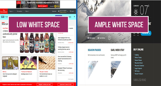
Although negative space is often referred to as white space, it doesn't actually have to be white. You can also use full-color backgrounds to animate empty space without making too much clutter in the process.
Play Around With Contrast
Designers end up choosing a white background 99% of the time because it's the perfect setting to play around with contrast .
Contrast can be created using color, location, scale, shape and size. It attracts the user's attention to a specific design element, while at the same time creating a certain visual hierarchy.
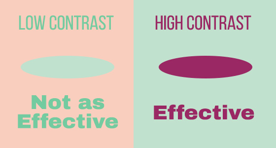
Not only that, but high contrast can actually help make your content more readable, allowing for an excellent user experience for the visitors. The best example is the simple black or white background coupled with a bold image or small, yet colorful elements.
Use Dramatic Typography
The vast majority of content available on the internet is in the form of text.
Custom typography with sharp and beautiful lettering is an excellent focal point in the overall minimalist framework. It directs the visitor's attention to the content itself while creating a larger and more intricate visual experience.

The most used type of minimal design and typography includes bold styles coupled with thick strokes and attention-grabbing letter-forms.
Don't shy away from using more than one type, just make sure they are different enough to be recognized, yet similar enough to complement each other perfectly.
Bottom Line
These are just some of the features used in minimalistic web design. As you can see, it's far more than simply removing a bunch of different elements and slapping on a white background.
It requires a certain level of expertise and a sharp eye for detail and if not done correctly, it can have an adverse effect on your brand and business.
Less is more, but only if less does more. The focus is always on user experience, so designers need to create websites that are not only beautiful in design, but also practical to use for the average Joe.
See Also: Why Do You Need a Website Redesign Strategy?