Here are images of some of the most widely visited sites in the world.
Google:

YouTube:

Wikipedia:
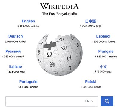
And Facebook:

Notice anything these sites all have in common?
In terms of web design, these sites all use black text with a white background. Even some of the largest retailers including Amazon and Apple implement lighter backgrounds in their site design.
There are several reasons why this color scheme in web design is so widely used:
- HTML and CSS styling in browsers default to white
- Text on lighter backgrounds is better for readability
- Images stand out more on white backgrounds
- Black on white color schemes provide better contrast
These are all valid reasons as to why most companies use white backgrounds in their site design. If you are planning on refreshing your web design, the safer choice then would be to stick with a dark text on a light background.
Still, there are plenty of sites and even mobile apps (e.g. Spotify) that use dark themes to great effect. But before implementing this color scheme, there are several best practices to follow.

Here we look at several ways to elegantly pull off a dark web design.
1. Use More Negative Space
Negative space is an important concept in web design. It refers to the empty space around objects on a page such as text and images.
While it might be seen as "wasted space", using negative space gives you far more control on your message and contributes to a better browsing experience.
Consider the following example:

An overcrowded design such as this one creates confusion. The entire page is cluttered with numerous elements that are all competing for attention such as the navigation bar and ads. Any visitor landing on this page would instantly be overwhelmed and distracted.
Less Is More especially when it comes to website design.
Here is a good example of how ample negative space can be used to create a more elegant look:

Negative space helps to divert attention to the main content which you can use to your advantage to highlight important elements such as your offer.
See Also: Achieve More With Less - Simplistic Web Design Trends to Follow in 2017
2. Focus on Readability
Readability is a major concern for all online users. One online poll found that nearly 47% of readers preferred lighter backgrounds. By contrast, only 10% indicated they preferred darker backgrounds while 36% said it depends on the site.
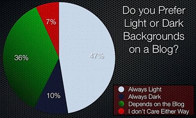
Dark text on lighter backgrounds is generally preferred simply because it is easier to read. But when designing a site with the opposite color scheme, it is especially important to pay attention to the text itself. Visitors won't stay on your pages for long if the text is too difficult to read.
Here are several ways to improve readability on darker backgrounds:
- Increase negative space: Increase the space around the text by adjusting the kerning and leading of the fonts. Adjusting the line spacing also makes it easier to read text.
- Increase font space: Similarly, using a larger font size also helps to improve readability as it means more white space around each letter.
Here is an example of how text spacing and font size affect readability:
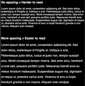
When setting typography, use dummy text to experiment with different settings to make sure that the text is legible.
3. Use Colors Sparingly
Having too many colors on darker backgrounds can make a page feel busy and cluttered as seen here:

Web Designers should instead opt for minimal color schemes for a more elegant look on darker backgrounds:
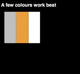
Sticking with only a few colors works best for darker backgrounds as seen in the examples above. Using a single color in key areas on a page can also be used to great effect as seen here:

The color green makes the logo immediately stand out on this page and attention is then diverted to the Download Now button which is in the same color.
Use color sparingly on your own pages to give emphasis to certain points (e.g. headline, logo, buttons, etc.).
Conclusion
Color plays a major role in web design. While white backgrounds tend to be more commonly used, there are still plenty of sites that implement a dark theme.
Before taking a similar approach with your own site, follow these tips on pulling off a dark web design elegantly.