Gone are the days when websites were merely used as a ground for your existence. It is more than that now. Through it, you can efficiently communicate with your users and take the engagement level to a whole new level.
To grab more eyeballs you need to make your website more attractive and have a unique layout of the site.
In the dynamic web industry, designing is the latest trend. With new tools and techniques evolving every day there has been a transition in the perspective of how web design is looked upon.
Enterprises are constantly introducing new methodologies and are developing innovative styles. It is quite difficult for enterprise to be in the industry and to face the challenging norms but with websites, you can have a strong online presence.
Please note that some of the links provided in this article may be affiliate links and we will earn commission if you buy their products through our links.
The Web Designs that You Need to Follow
We have witnessed a lot of changes in 2016 and as the year comes to end, we firmly cross our fingers and ponder for a while, what 2017 could bring to the table for web development especially web design.
Keeping your finger on the pulse of web designing is imperative if you want to change accordingly. Questions like which trends will come up next and which to follow?
Therefore, we have compiled a list of some of the web designing trends that you can follow.
1. Semi Flat Design
The design is the important aspect of your site and you should always incorporate new ways of making your website attractive.
Semi flat design has become the new style statement for your site. Flat design has been replaced by semi flat design as they increase the usability and readability.
You can integrate depth, subtle shadows and dimension for making the design more attractive.
2. Larger Font Size
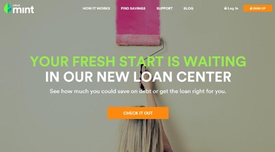
The bigger the better. Large fonts have replaced small fonts. The reason being, large fonts can easily be seen and has the power to grab the user's attention.
Reading small fonts text on mobile devices is horrendous but with large fonts, the readability has been increased and has become one of the popular flat design trends.
But that doesn't mean you should use large fonts everywhere. Maintain uniformity and use large fonts only for headings or to highlight important things.
Just ensure that you use a web-friendly typeface that doesn't affect the functionality.
3. Loading Animations
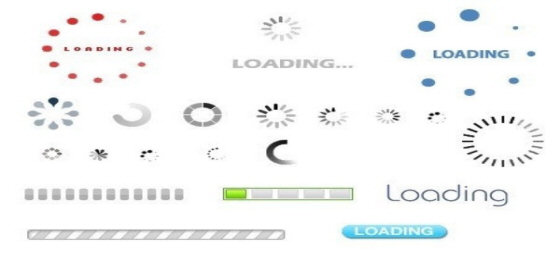
You should entertain users even when they wait for the site to respond. Irrespective of how long or short the response time is you should always engage users with activities.
Therefore, loading animations are now seeing the brighter side as people are using it so that users don't think of moving out of the site.
4. Using Great Typography
Good websites make users come again and again. What makes them attractive is how they use great and unique fonts.
Typography is a great way of creating a positive impact on users. Combining images with good typography create an astonishing impact.
Use unique fonts to stand apart from the rest and do away with traditional and similar fonts.
See Also: 30 Excellent Typography Tools and Resources for Designers
5. Motion Animation:
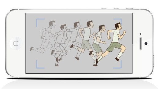
Motions can easily grab more attention than any other thing.
Incorporating motion animations in your site could be an important asset and help your site's visual hierarchy.
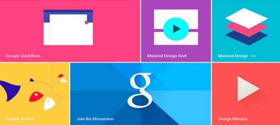
6. Google's Material Design
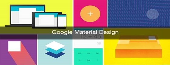
How about taking the advantage of Google's material design?
Google has introduced this new designing tool and designers are following the suit. The concept of this web design framework is to include layers for creating shadows with edges of elements and adds depth and style to the website design.
There are many free Material Design UI available to get started with.
See Also: Google's Material Design- Core Principles, Apps and Frameworks
7. Custom Made Illustrator:
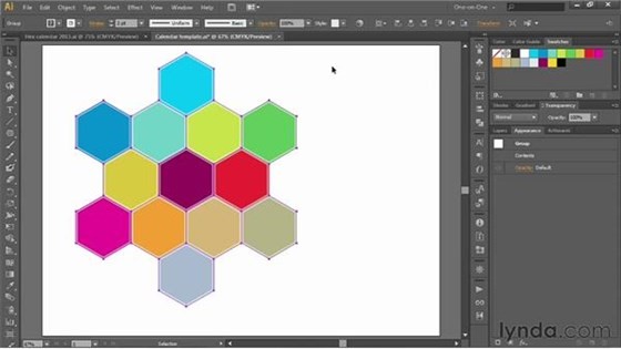
There's no doubt that you use elegant themes for your site but little of you might know about that particular theme has already been used on other sites and your site is not unique.
Though, using available themes save you time and money so why not invest in customized illustrator for having even more growth rate?
Customizable illustrator not only makes your site look unique but also helps you in editing and modifying your site the way you want. Have complete control over your site now.
8. Centered and Split Content:
Centered and split content are pertinent for your websites for making them attractive.
You can place the text or messages at the center of the screen and utilize the remaining space with images or infographics.
This way you give your site more visual experience and smooth texture for an enchanting visual effect.
This layout works fine with the site having minimal content. But that doesn't mean sites with more substance cannot use this layout. They can and have the benefits of content layout design.
Centered and split content layout divides the screen into different sections that can be used accordingly. By doing that, you have sections for dedicated operations without any ambiguity.
This gives designers the freedom of being more creative and designing the site the way they want it to be.